

THE SAVE MOVEMENT
MOTION GRAPHICS
The Save Movement, rebranded as 'Animal Save Movement', is a global organization that holds vigils at slaughterhouses to bear witness to exploited farmed animals during their final moments, in the hopes of providing them comfort and promoting veganism.
When I arrived on their Graphics team and Video & Animation team, they had been using the same branding for nearly a decade. As the organization grew to serve different missions, they decided to rebrand into 3 branches: Animal Save, Climate Save and Health Save.

Client


LOGO ANIMATION
Ae
Adobe After Effects CC 2019

Shot on Panasonic Lumix DMCG7 Kit 14140mm


The Graphics team created the logos and brand identity. I was tasked with bringing their logos to life by animating them, along with other short videos for social media campaigns.
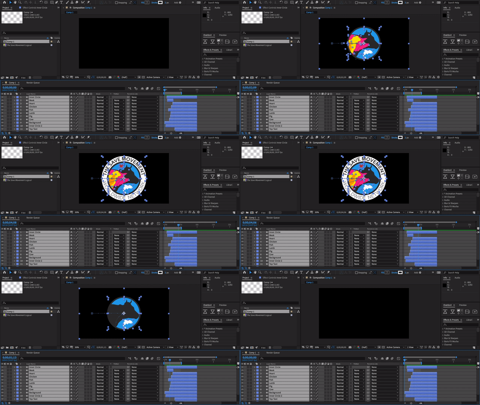
I started with the team, prior to the rebranding, after first animating the original logo in Adobe After Effects.
The motion design took advantage of the circular shapes and text path for a spin and classic resize animation in order to characterize a quick 'in-and-out' effect. I also utilized the animal and heart layers to create variation and momentum for the subsequent spin of the text. The result is a seamless animation focused on speed and simplicity.
The heart animates last to flow through all the animals and signify love for all beings.
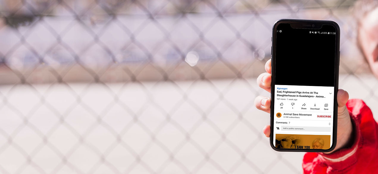

Once the rebranding had been established with 3 branches, I was given the type versions of each logo to work with.
The goal was to display the new branding in a meaningful way that would not elicit confusion. I had to demonstrate that the new branches evolved from the focus on animals, and were not departures but rather extensions of the same organization, now called Animal Save Movement (ASM).
Funded primarily through donations and with a distribution plan mainly for their Instagram and YouTube platforms, having their target audience in mind brought a clear challenge and goal for me to focus on. Social media users normally don't give individual content much time, and the intended viewers of ASM's videos don't usually have much time to give during many of the instances that the videos would be viewed. Animal rights activists only have the attention of those they outreach on the streets for so long before they continue on their way.
The animation had to be quick so as to not interfere with the viewer's time, especially when watching several videos in a row. I had to keep it simple but not boring or repetitive. To help accomplish this, I referenced a mood board encompassing elements of type movement, speed, fluidity, and tireless repetition.

LOGOTYPE ANIMATION BRIEF & MOOD BOARD
STEP 1. DISCOVER

DELIVERABLES:




LOGOTYPE ANIMATION SCRIPT & STORYBOARD
STEP 2. DESIGN
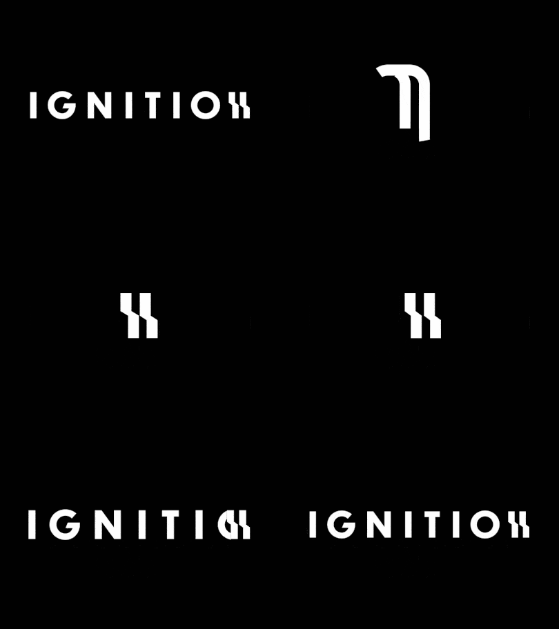
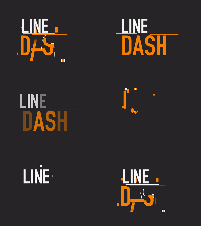
Before beginning in After Effects, I used a story board to explain the ideas behind the animations for the team to review.


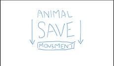


"MOVEMENT" appears next to help amplify that the Save organization is part of a movement for animals, first and foremost.
I chose to have "SAVE" & "MOVEMENT" drop suddenly as if by gravity to simulate a banner drop, since banner drops are a common action of awareness activism.
"CLIMATE" & "HEALTH" birth from "SAVE MOVEMENT", as they are extensions of the brand which developed initially from a movement for animals. I wanted to show that they branch out with the use of a splitting animation.

LOGOTYPE ANIMATION STYLE & TIMING
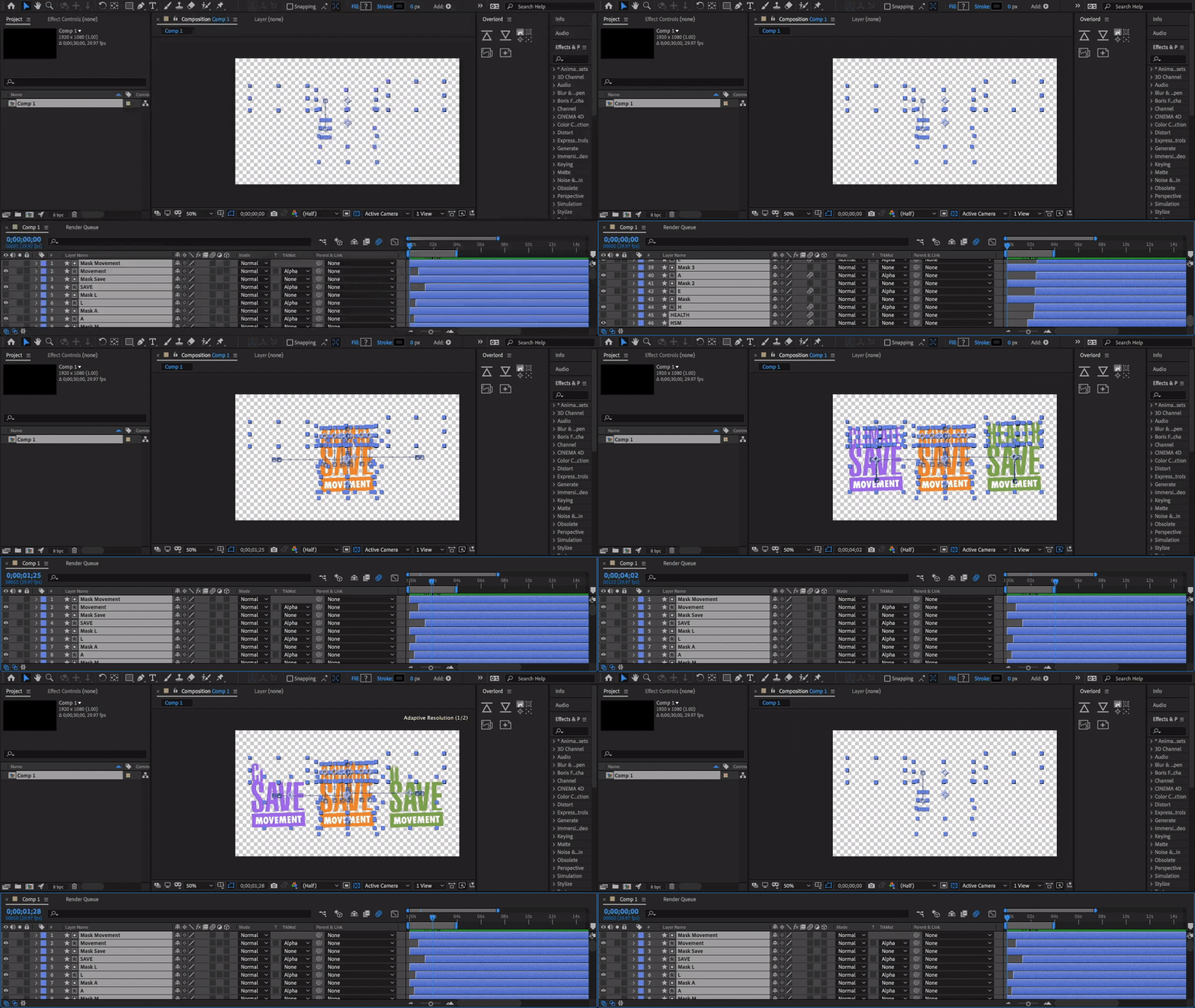
When putting together the animation for the logotypes in After Effects, I included a slight overextension towards the end of each element's path of motion, before landing on it's final position in the frame, in order to add a bounce to the movement.
The movement was given bounce and motion blur for invigoration, to make the animation more interesting and varied so that it would not become as wearisome when watched repeatedly, as would be the case with frequent video posts.
EMBLEM ANIMATION BRIEF & MOOD BOARD
STEP 1. DISCOVER
The Graphics team had also created an emblem logo for ASM that I was tasked with animating, which featured an illustrative graphic of an animal's eye. This brought up a number of new challenges. One being the challenge of ensuring the animations would remain congruent with the brand identity, as well as the original designer's vision.


All the elements move into position quickly and remain stationary for most of the animation, ensuring they are given enough time to be read while keeping that time to a minimum.
Once the animation work was completed, I created a sample video for the team to review what the animation would look like in the context of a video
intro and outro.
STEP 3. DELIVER
In thinking about why ASM was created, and what has always been the main focus behind everything they do, I thought it would be fitting to have "ANIMAL" shown first and last in the animation. Each letter pops up individually from behind a mask layer, as I observed from several examples in my mood board that it helps to create an appealing and tireless motion.
This included the challenge of portraying the right 'feel' from the eye's movement. It needed to avoid being too fun. How would I differentiate a blink from a wink? This was resolved with regular meetings every week, where I was given feedback that the eye needed to move slower, blink less, etc... My starting point was to observe a mood board featuring eye movement and circular, emblematic elements.


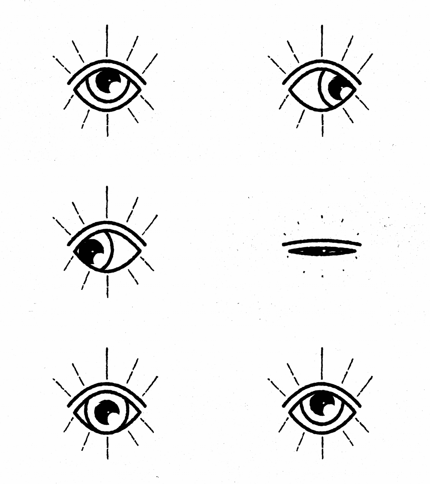

My goal was to animate the eye realistically and not comically. To do that, I needed to also reference actual video footage of an animal's eye. A pig's eye; the animal the illustration was based upon, since the entire Save organization first developed from it's beginnings as Toronto Pig Save. I wanted to see how a pig would really blink.
EMBLEM ANIMATION SCRIPT & STORY BOARD
STEP 2. DESIGN
As in the previous logotype storyboard, the animal appears first and last; as the main focus. I also had to think about how I wanted to make the viewer feel, as well as the experience of the animals when they are on the trucks. The time spent with the animals during the Save Movement's vigils commences so suddenly as a slaughterhouse truck pulls up, and ends just as abruptly when the truck quickly pulls away and they are taken to slaughter. The eye appears from the dark, as if approaching the hole to see those who are bearing witness, and disappears back into the dark soon after.


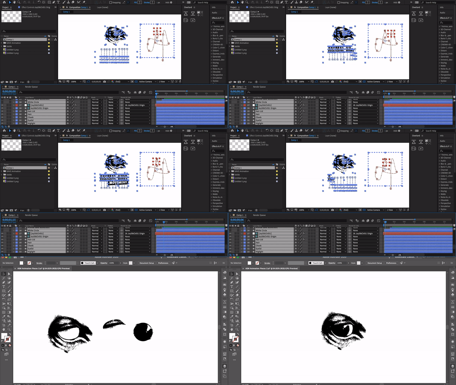

Another challenge with this version of the logo was working with a raster image instead of the usual vector shapes I was used to using in After Effects.
First I had to break down all the elements of the eye to work with. Then I had to recreate or complete certain elements that would show in the animation which weren't fully developed in the original logo files handed to me, like the pupil or separation of the eyelid.
I then created a joystick with a plugin to maneuver and warp the rasterized eyelid more easily.

The motion design once again took advantage of the circular shape for a quick resize entry and exit animation. The eye follows the text as it appears in the earlier variations. This was changed as the emblem was being finalized, and the result was the eye then following two dots as they appear.
