


TASKEL APP
UX/UI MOBILE APP DESIGN
Commuting in the city can take quite a while, and the hours really add up when it is performed daily. Our time matters, perhaps more than anything else, so it's important to always make the most of it. That’s why I asked, “If commuting uses so much of our time, how can we make the most of it?”.
Student
USER EXPERIENCE
Ai
Adobe Illustrator CC 2017
Sketch
CONCEPT
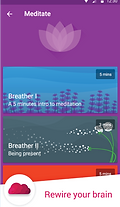
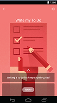
We’re naturally productive creatures...but we’re also lazy, so whether it's catching up on Zzz's, or Om's, reading a novel, or writing one, Taskel is here to help. The app helps users to have a plan of action during their travels, and stick to it.
Taskel = Task + Travel
GOAL
The goal was to make commuting something to look forward to; turning the city of attitude (Toronto) into a city of gratitude. If we’re able to be productive, delve into our passions, or even try something new during that time we commute, it might not be so bad. So I was to design an app that sought to assist the public with incorporating an assortment of tasks into almost any method of travel.
FEATURES
Alerts allow complete focus on the task at hand, so users can lose themselves in their work without the worry of losing themselves in the city by missing their stop (an occurrence which has happened at least once to each of the interviewees). Users are able to select how many notifications they receive, how they receive them, and how soon before arriving to their next destination. They are also able to select any number of tasks for each stretch of their commute.
USER RESEARCH
STEP 1. DISCOVER
To design for real-life experiences, I conducted a series of 6 informal “Sidewalk Converation” interviews. My research had brought an important issue to light. When asked how they felt about the attitudes other passengers portrayed while commuting, all respondents seemed to believe that, more often than not, nobody was happy to be there. Several people from neighbouring cities and provinces had even come to associate the city with the idea of a rude and introverted populace. I believed that if people in the city enjoyed their time commuting, that perception might change.
I geared my questions towards my primary goal and finding how users felt about their experience with commuting throughout the city of Toronto. All interviews were conducted informally with an open-ended qualitative questionnaire. The information that I collected through the interviews molded the personas which I used to craft a customized, relevant user flow.


MOOD BOARD
This collection of apps was used as inspiration for the travel, task, and alarm aspects and functions of Taskel, before starting the design phase of the project.


COMPETITIVE ANALYSIS
The design rational behind Taskel was greatly influenced through the Competitive Analysis of a habit-setting app, called ‘Fabulous’. Fabulous is one of the most encouraging, effective, and aesthetically pleasing apps I have ever used. Designing an app that sought to develop productivity and happiness, in a circumstance that appeared to lack both, simply wouldn’t work without those three properties. So many people struggle all the time with staying focused and getting things done. By following the design decisions in Fabulous, and offering a multitude of possibilities for what people can do with their time, along with inspiring success stories, Taskel will hopefully create an experience that is fun, and has users looking forward to their commutes (because of what they too might be able to accomplish).


STRATEGIZE
Before creating the user interface, I wrote out all my ideas and created a Strategy Plane that focused on the app’s objectives.

WIREFRAMES AND USERFLOW
STEP 2. DESIGN
It was important that users have flexibility to assign and change tasks on the fly, since contingent circumstances arise at any moment in the city. For instance, if a passenger were entering the subway at a time when the train is packed, they may not have access to a seat, and so rather than read they may try instead to practice a standing meditation. To accommodate this, I decided to have each step of the process accessible on every screen.


USER INTERFACE
Ai
COLOUR PALETTE
STEP 2. DESIGN
To help users feel encouraged to be productive, I decided that Blue should be the main contributor to the app aesthetic, as it represents productivity in accordance with Colour Theory. Magenta packs a powerful visceral punch that acts as a great tool for guiding users through their task planning, and may have the added benefit of bringing a bit of fun and energy into the app interface. Blue is known to stimulate the mind, and red – the body, creating an essential balance in an app that involves all methods of travel.


ICONOGRAPHY
I decided to portray a timeline for the commute in the form of a progress bar, with a vehicular icon slowly advancing from the left end of the line to the right. Simple graphics of roads were used to help relate the idea of travel with the main function of the app, tackling tasks.
TYPOGRAPHY
It was also important to me that the tasks Taskel provides/suggests are relevant to the current mode of travel, and that if a user wished to complete multiple tasks during a single commute, they know which task to focus on at any given moment. To make it clear which tasks had been selected and which was currently active, I decided to surround the applicable words in a coloured ‘bubble’. The corners were rounded because I believe that helps to create a more relaxed, friendly, and easy-to-manage feeling while using the app. While productivity was the main goal, having people enjoy their commutes was a secondary goal, and I wanted to help users feel calm before getting started. I used a clear and simple typeface for the headings (Ubuntu) and bodies of text (Source Sans Pro) in the hopes of catering towards both goals. Having text that is easy to read allows readers to absorb written material faster, and having text that is difficult to read might become a stressor.

COMPOSITION

STEP 3. DELIVER
Visual flow was used to help users know how much time is left in their current task. Opacity was used in the task lists to provide a Visual Hierarchy that indicates a scroll function, when a margin-slider would have cluttered the screen (reducing the apps ease of use). Alignment was used to allow users to easily to see which tasks refer to a specific mode of transportation. Shadows were used to encourage interaction with ‘advancing’ buttons and maneuverable indicators (e.g. the pink ‘Task Switch’ indicators which appear on the timeline during the task selection stage can be moved along the line to set a desired time for the start of a new task).

FEEDBACK
STEP 3. DELIVER
This app was a project piece for HackerYou’s User Experience course of Spring 2017. TTC refers to Toronto Transit Commission, the public transport agency that operates bus, subway, streetcar, and paratransit services in Toronto, Ontario, Canada. Ricardo Vazquez was my instructor, and a great one too!

MOBILE PLATFORM
A mockup of Taskel on an Apple iPhone, though the app would be intended to support both Apple and Android devices.
